Graze (YCN)
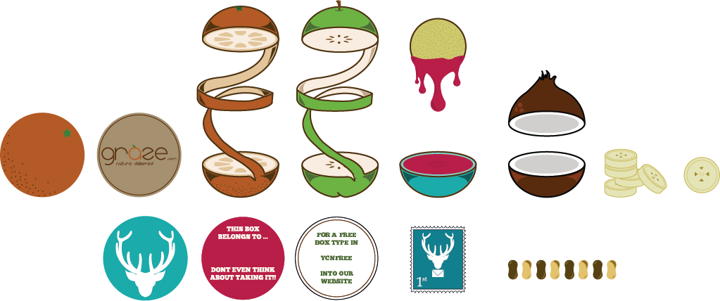
The brief was for he YCN student awards and asked to rebrand the graze company, asking to incorporate both technology and nature into the design while still making it appeal to their target audience. The logo has been created using a typeface that I created specifically for this brief, combining the slim, clean modern attributes of technology while keeping it fun and friendly for the nature side of the company. The info-graphic to the right would be wrapped around the graze box on delivery and held together using the ‘natured delivered stamp. The design showcases all of the products that graze has to offer. So that while they are eating their lunch they can sit and consider what they want to try next time by following the flow chart and answering the questions about themselves.